The fastest and easiest way to stick a row in Beaver Builder to the top of your page as you scroll is to add a couple of lines of CSS (and I’ll give you this CSS to copy and paste).
Example: How I sticky a row on my blog to enhance my user-experience
I recently did the sticky menu and scroll to feature on this website, WagePirate.com.
See this row below with the pink background that sticks to the top of my Product page as my users scroll?
When you click these menu items, it scrolls you to that section on that page.
So yeah, I’ll show you how to stick that menu like I’ve done in the next tutorial, but for this one we’re going to start with the basics and keep it nice and simple.
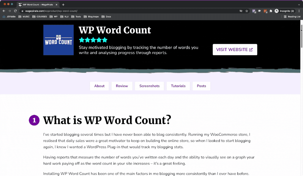
For this tutorial, we’ll be working on this design below.
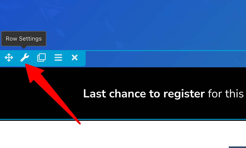
We’re going to stick the black row to the top on scroll so that the Register Now button is accessible for our users as they scroll the page.

Let’s start!
Add this CSS to sticky a row on scroll
Here is how to sticky a row to the top of the page when scrolling with Beaver Builder.
Go to the row you wish to sticky to the top of the page and go to it’s Row Settings.
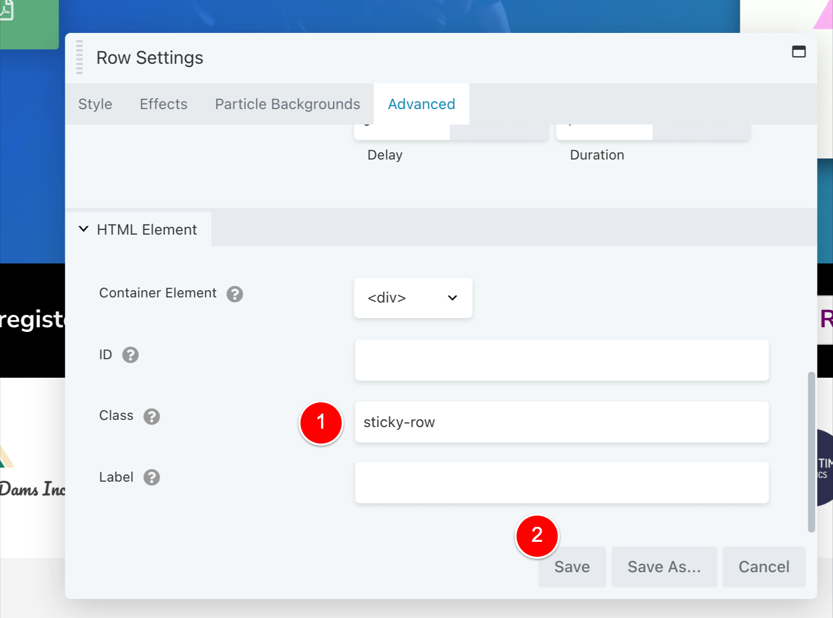
Then in the Advanced tab, add the CSS class sticky-row (1) like the below and then Save (2).
That’s all we need to do in Beaver Builder for this page.
Just save the page like normal so that you’re out of the Beaver Builder editor.
Next, edit your Child Theme’s style.css file in /wp-content/themes/yourchildtheme/style.css and add the below code to the bottom of the css file.
@media ( min-width: 769px ){
	.sticky-row{position:sticky;top:0;z-index:99;}
}
Code language: PHP (php)
And…. that’s it!
Save your .CSS file and refresh your page to see the effect in action.
How this CSS works to sticky a row
Let’s look at what this CSS code is doing, step-step:
The below code adds a CSS media query for min-width 769px:
@media ( min-width: 769px ){
}
Code language: PHP (php)
Writing our CSS code inside this media query means that our row will only sticky to the top IF the device the user is accessing your website on is AT LEAST 769px wide.
You probably don’t want to stick this row on Tablets in their portrait orientation or anything smaller because the device is quite small, so that’s why I have included this here. You can tweak this to whatever width you like.
Our next bit of code is what sticks the item to the top of the page.
And YES – position:sticky; is a thing in CSS (super easy, I know).
<meta charset="utf-8">.sticky-row{
   position: sticky;
   top: 0;
   z-index: 99;
}
Code language: PHP (php)
Setting z-index:99; will ensure our sticky row always stays on top of the items on our page while we scroll down past them.
Setting top:0; just means that the row will stick to the very top of the page (i.e. 0px from the top).
If you have a sticky header on your website for your main menu, you can change the top:0; value to be whatever the height is of the header you have stuck to the top.
So, if your Site Header that is stuck on scroll and visible all the time is 80px tall, and you want your fixed row to sit under this header, you would just update the CSS to be the following:
<meta charset="utf-8"><meta charset="utf-8">.sticky-row{
   position: sticky;
   top: 80px;
   z-index: 99;
}
Code language: PHP (php)
Easy, right?