In this post, I detail all the tips and tricks I’ve learnt while integrating the BEM methodology into the websites I build using Bricks Builder so that you can learn from my mistakes.
I will add to this article as I learn more about how it works and some of the best ways I’ve found to do specific things – so definitely continue to check back and monitor the videos I post on my YouTube channel.
NOTE: This is about HOW to use BEM methodology in Bricks Builder
Not what BEM is: I won’t cover what exactly BEM is and how it works here today because I feel most people landing on this article already know what it is.
In today’s article you’ll learning the following:
- I’ll show you where to add your CSS code for modifiers to your BEM blocks / elements. For example, in this article today we create a .card element but then I show you where to add the CSS Code in Bricks Builder to modify it with a .card–dark modifier.
- l’ll show you how to manage your CSS in Bricks Builder VS using a Code Snippets plugin like WPCodeBox.
If you’d like a YouTube video or Blog Post on how BEM works theoretically – I definitely can – just let me know in the comments below.
For this article – I’ve organised each tip into its own heading so you can come back to a specific thing easily in the future.
Let’s get into it.
VIDEO: The Video Tutorial
In this video, I go through a new Bricks feature that makes BEM possible in Bricks.
The setting is called “Disable Class Chaining” and if you use BEM…
you’re really going to love this new feature.
The content on this page and the above video go hand-in-hand, so let’s keep going with this tutorial and start looking at how Bricks allows BEM methodology inside its interface…
Modifiers: Where to add the CSS code for Block modifiers
To handle this, I recommend using the “root” feature that Bricks has built into its Style tab.
Here’s a video where I go through where to add the CSS code for modifiers in BEM, but I’ll also go through some code examples below so you can get a faster understanding of what I mean.
So, an example…
Let’s say we have the below design where we have 2 design elements we will refer to as “Cards”.
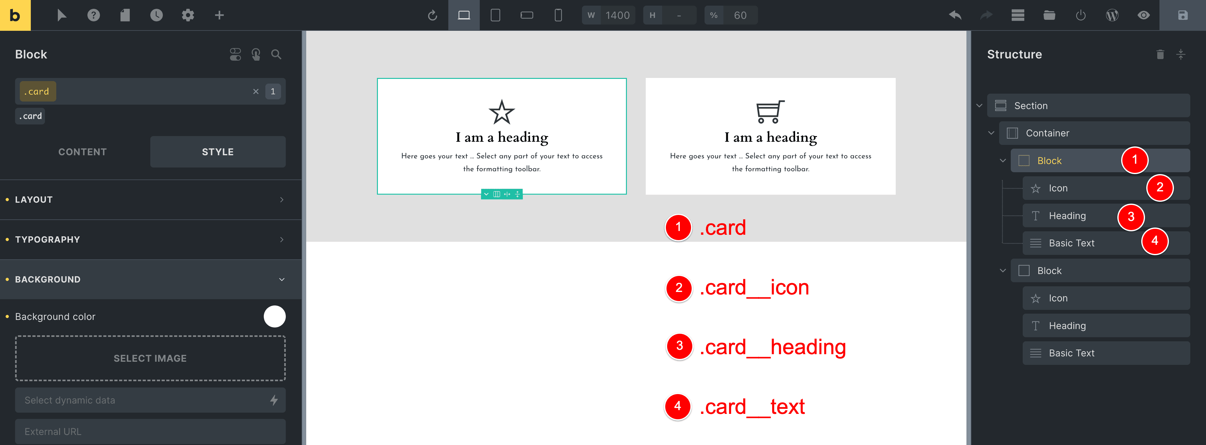
In case it’s a bit hard to see, the structure for each card is below, along with the CSS class I have assigned them as per BEM naming conventions
- Block element: .card
- Icon element:
.card__icon - Heading element:
.card__heading - Basic Text element:
.card__text
- Icon element:
… and I have added basic styling to some of these classes, such as adding a white background and some padding to the .card class
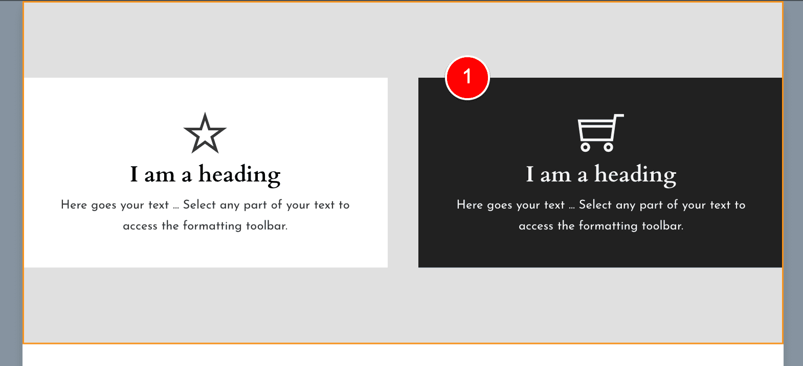
Now, let’s say we wanted to create a variation of this card element and have it be reversed in color, meaning that we want a variation of our .card element that has a black background with white text inside, like the image below at (1)…
Let’s go ahead and build this and by doing so we’ll see where to best add our CSS code for this –dark modifier class.
Step 1: Create the card–dark Global CSS Class in Bricks
We need to first create a new CSS class for our modifier for the card block.
To do that, we click on our card element at (1) and then create a new Global CSS Class in Bricks Builder called .card--dark, where we have the modifier –dark added to our card block.
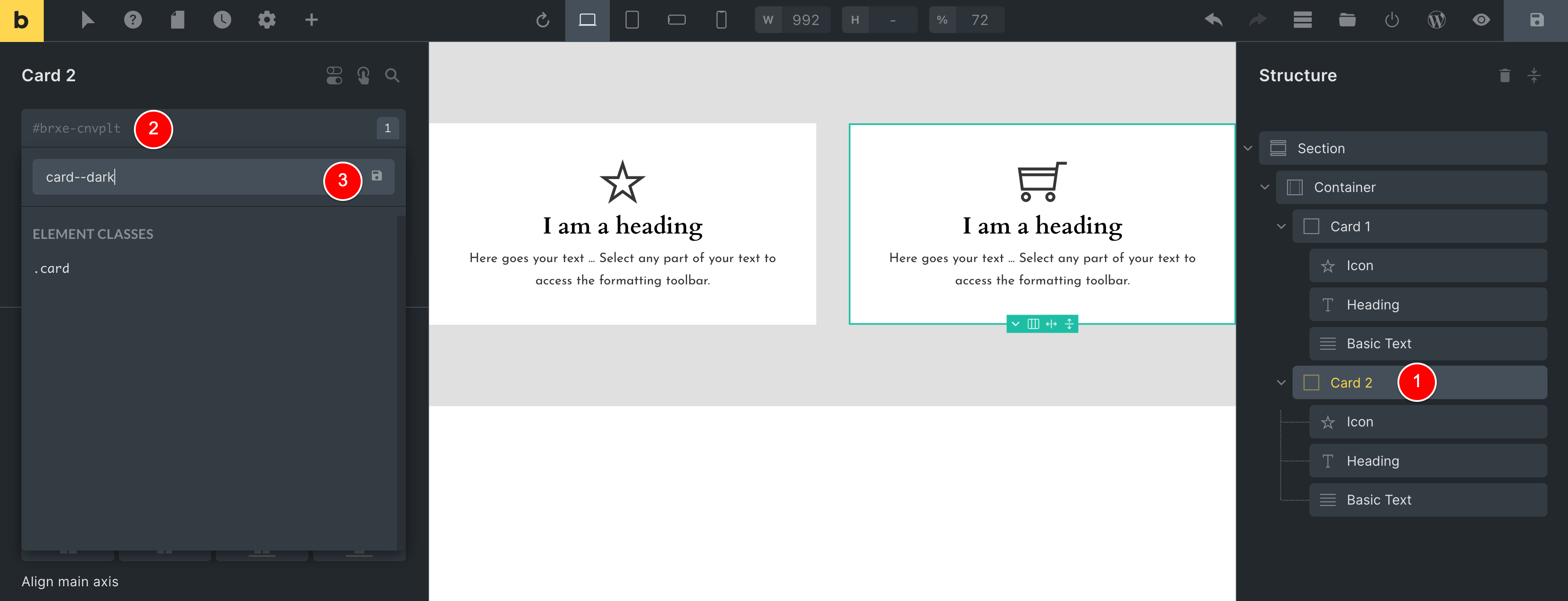
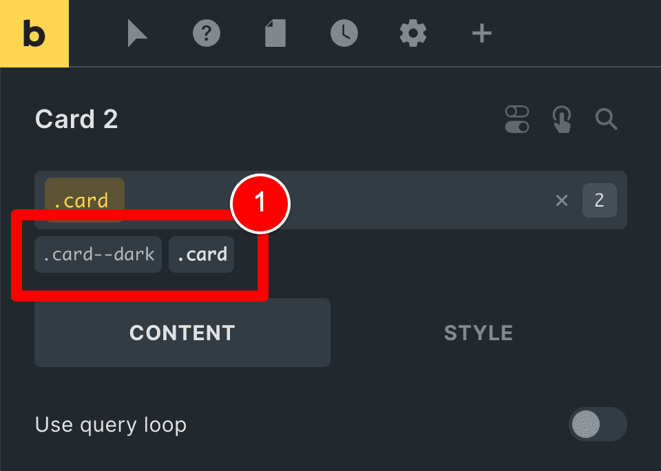
So now our .card parent element has two Bricks Builder Global CSS Classes applied, which are (1) .card and (2) .card–dark.
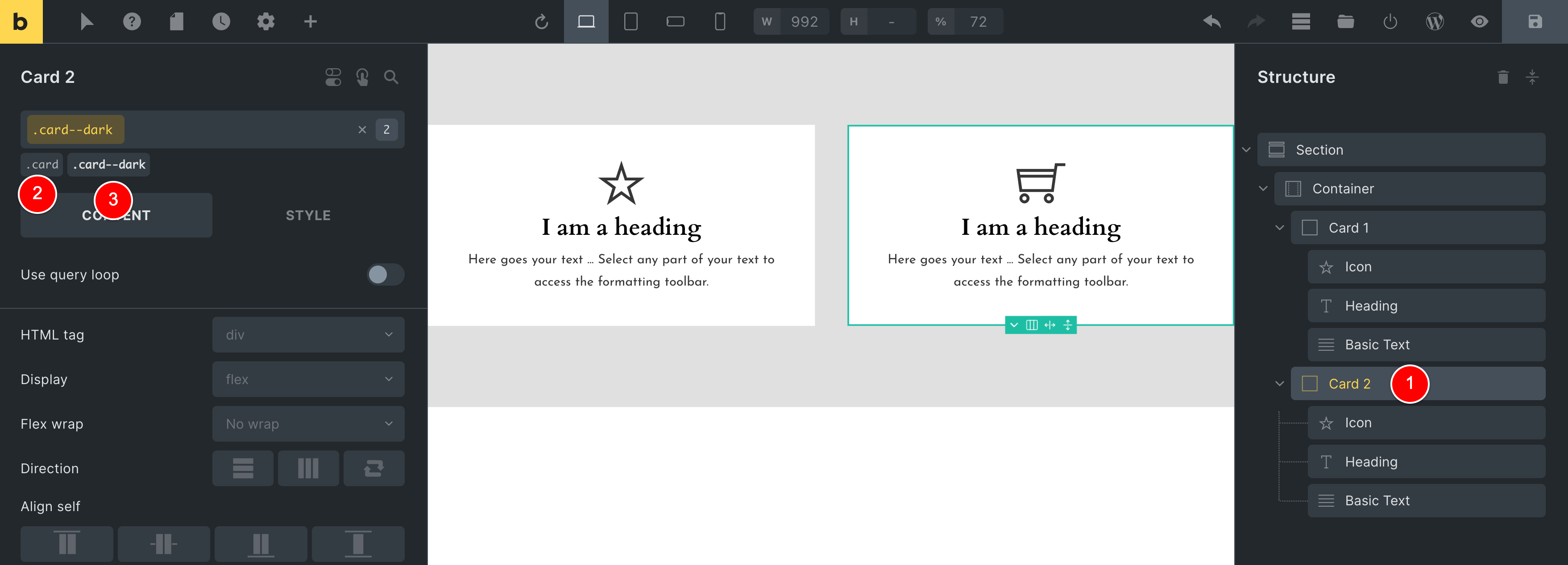
Next, let’s make sure we are editing our new modifier .card–dark CSS class, which we can confirm below as it is highlighted in yellow.
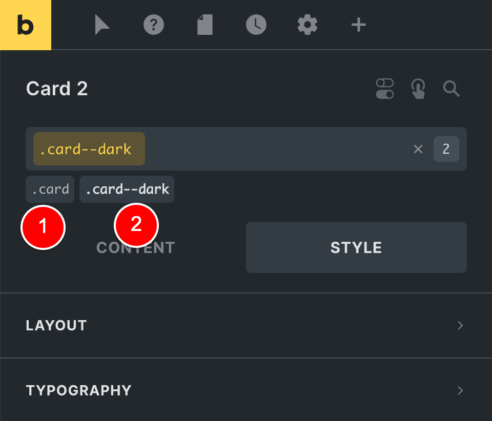
Step 2: Add our Custom CSS to the card–dark modifier CSS Class
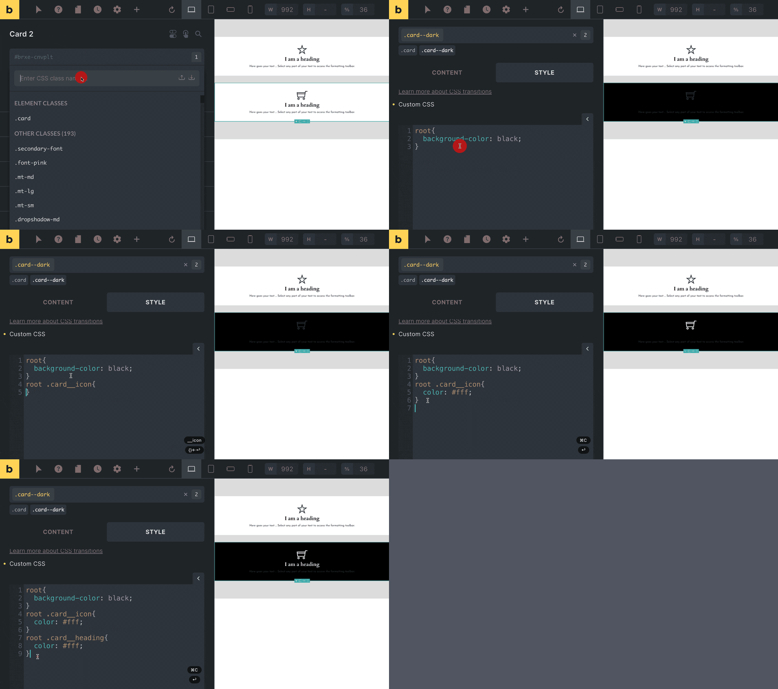
Now that we’re editing the .card–dark global CSS Class, here’s the magic…
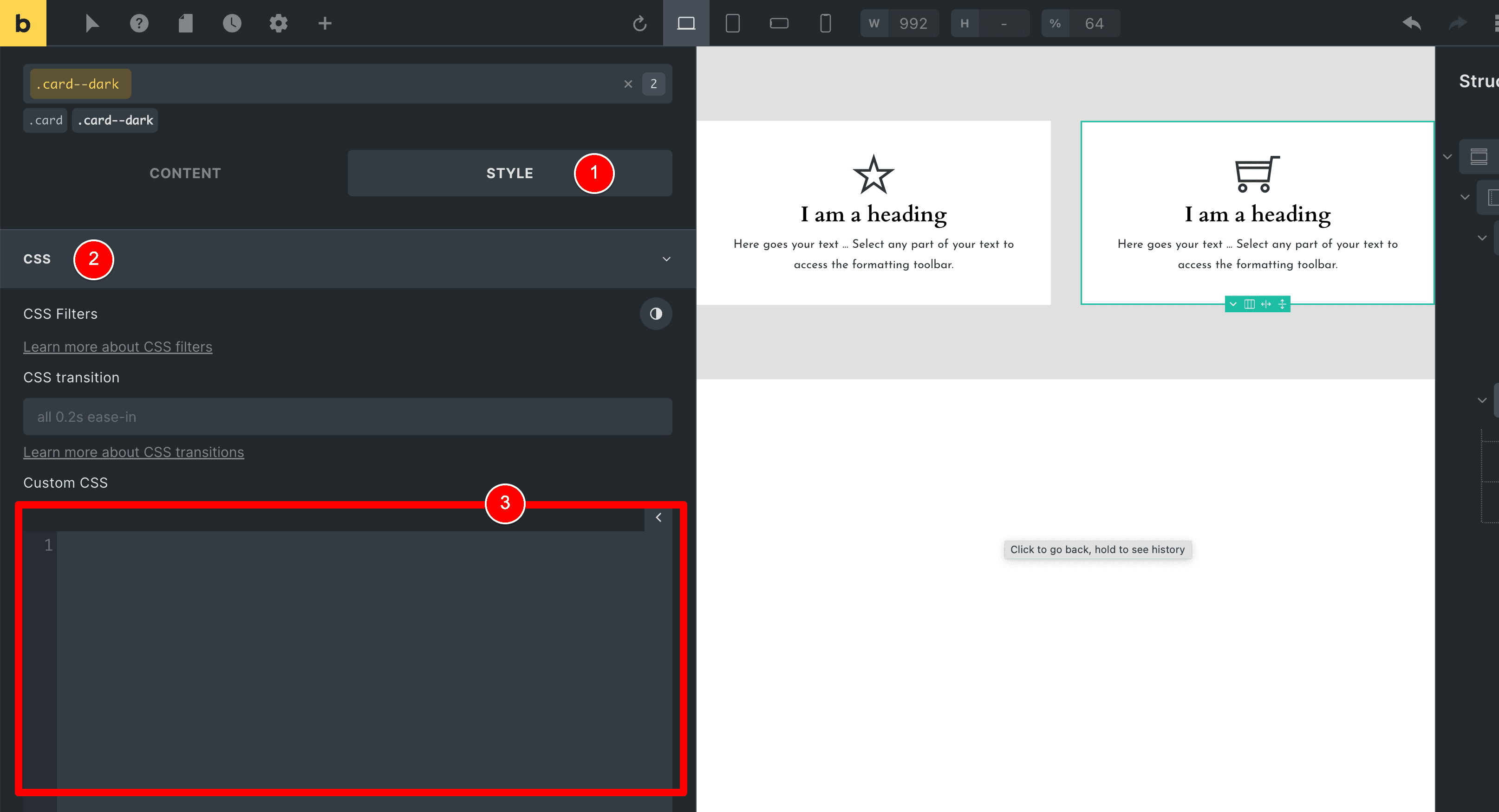
Head on over to the Style tab (1) and scroll down to the bottom until you find the CSS tab (2) with the box in which you can enter your custom CSS code (3).
Under this Custom CSS box, you’ll notice the following text (1).
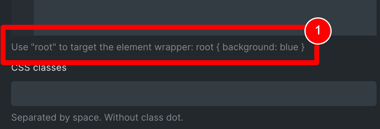
This is one of my favourite features about Bricks Builder – the “root” feature – and we’re going to use it to create the CSS code for our .card–dark BEM modifier CSS Class.
With the global CSS Class .card–dark selected (1), write the CSS code at (2) where we change the background color for this class to black.
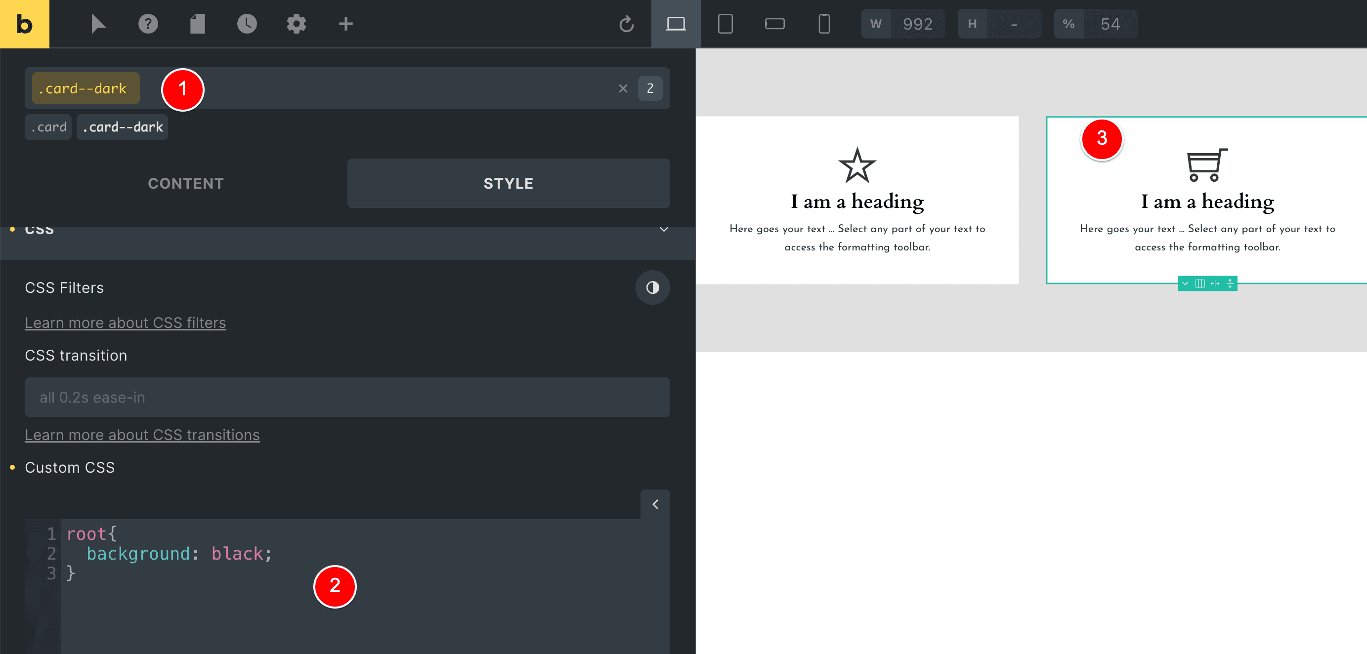
But we should actually see the card at (3) above change to a black background instantly, as soon as we write this CSS.
I know why this is occurring and how we can fix it, but I thought it would be good to leave this next part in for you because this involves using a new feature that Bricks Builder just released.
So, firstly… let’s look at the problem here.
Let’s save our page in Bricks Builder and then view the source code on the front end.
HELP! Why is this not working?
Our card–dark class is being overridden by the CSS styling we applied to the card class.
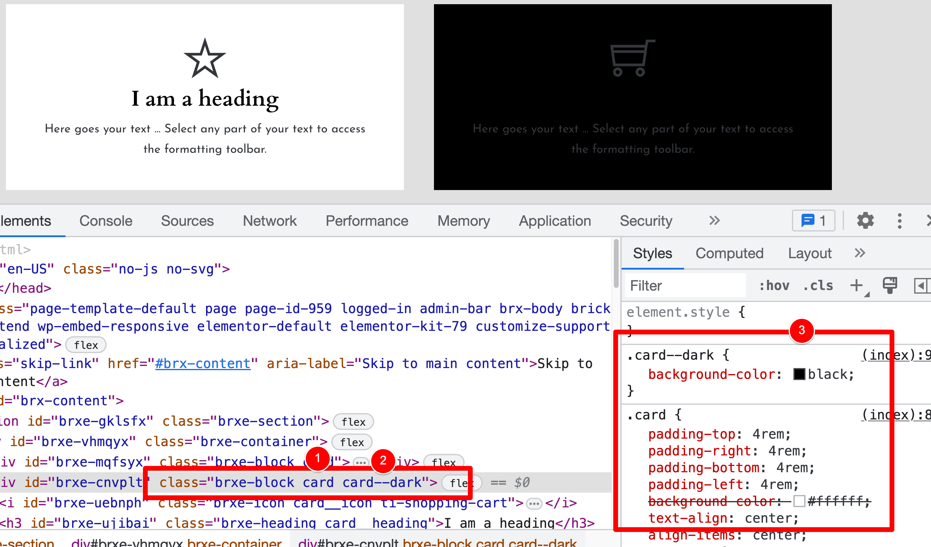
When I view the source code, I see the below when I inspect our element with the BEM modifier CSS Class card–dark (1) you will notice that our black background rule at (2) is being overridden by the white background rule at (3).
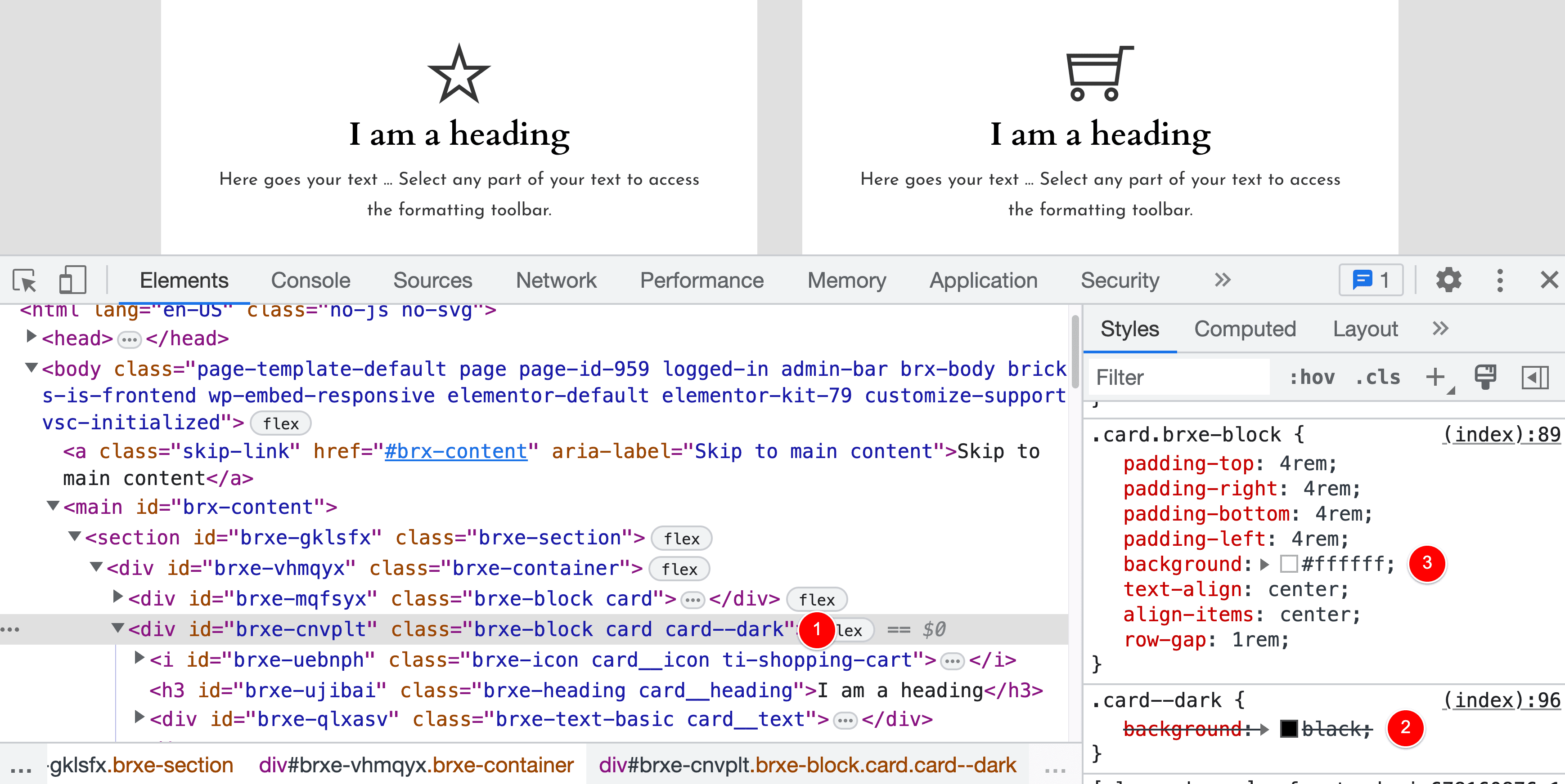
This is because of how Bricks Builder generates its CSS code (this is worth knowing – I promise).
When we create a new CSS Class in Bricks like our card class (1) and then use the Bricks interface to set styling for this class, like applying a white background at (2).
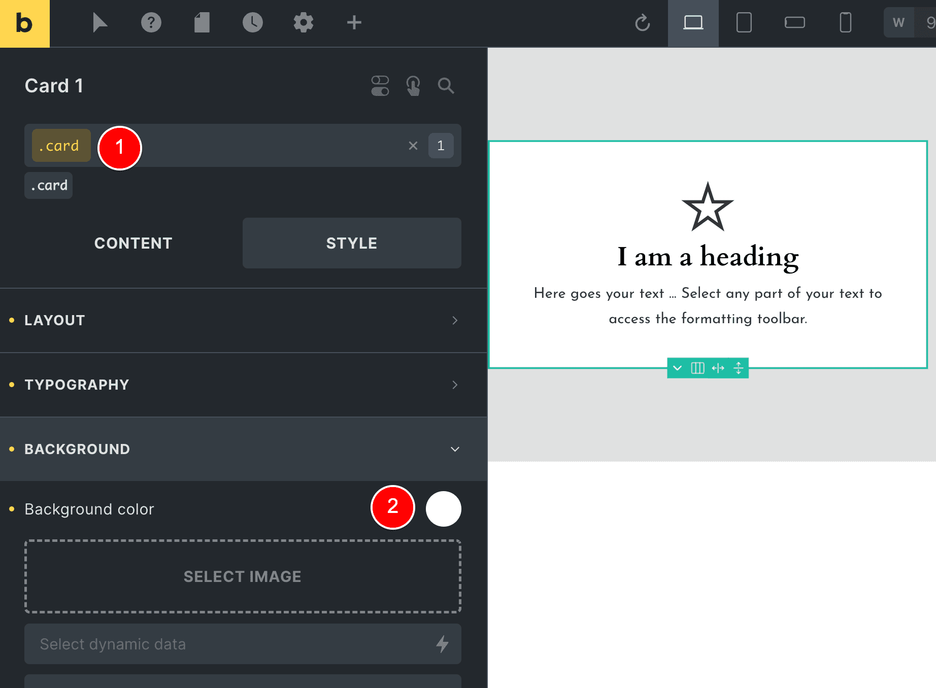
Bricks Builder automatically “chains” this custom CSS class to the Bricks Element you’re applying it to.
For example, here I created a new CSS class called .card and I am applying it to a “block” element inside of Bricks Builder.
You can see this below where brxe-block shows that it is in fact a “Block” element that I applied this .card class also (1) and that is why at (2) the actual styling is “chained” to the block + css class combination which results in .card.brxe-block.
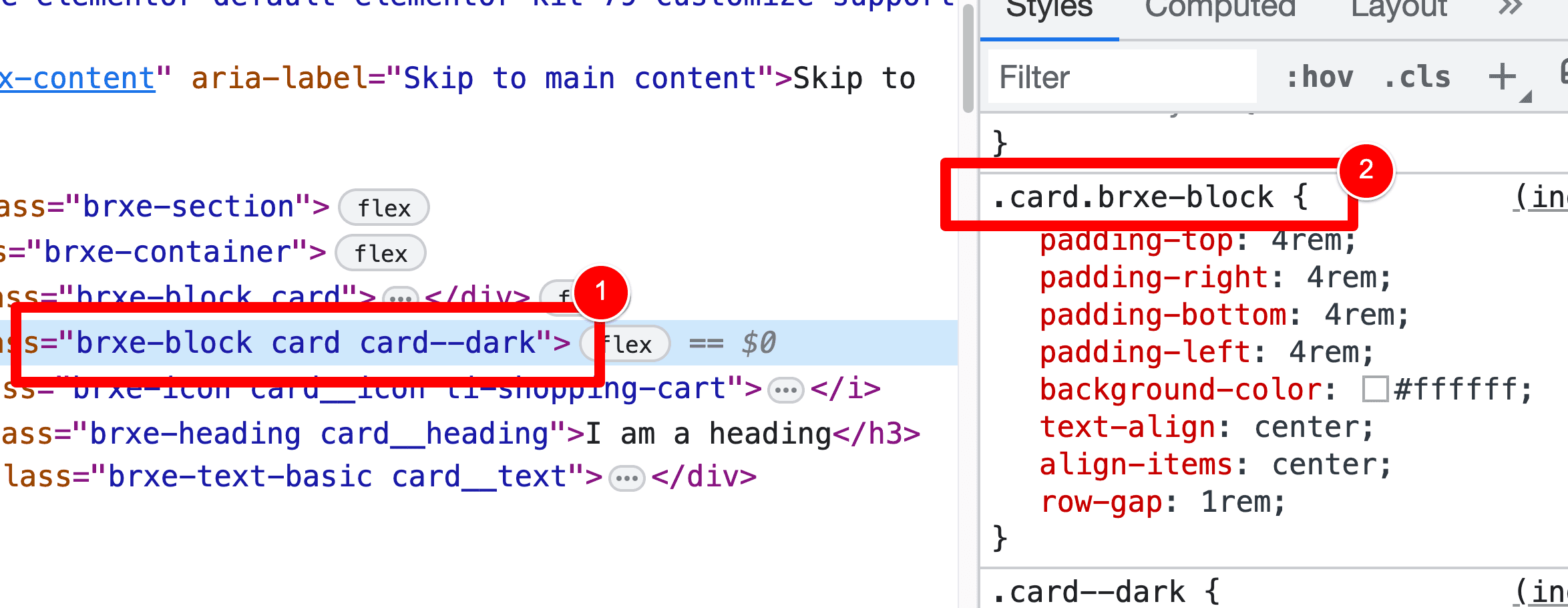
… and that’s our problem!
.card.brxe-block has more specificity than our .card-dark CSS class, which is why it is overriding it.
But fear not!
Here’s how we fix this…
Step 3: Disable Class Chaining
We need to take advantage of a new feature that was just released into Bricks Builder by doing the following.
Go to your WP Admin > Bricks > Settings.
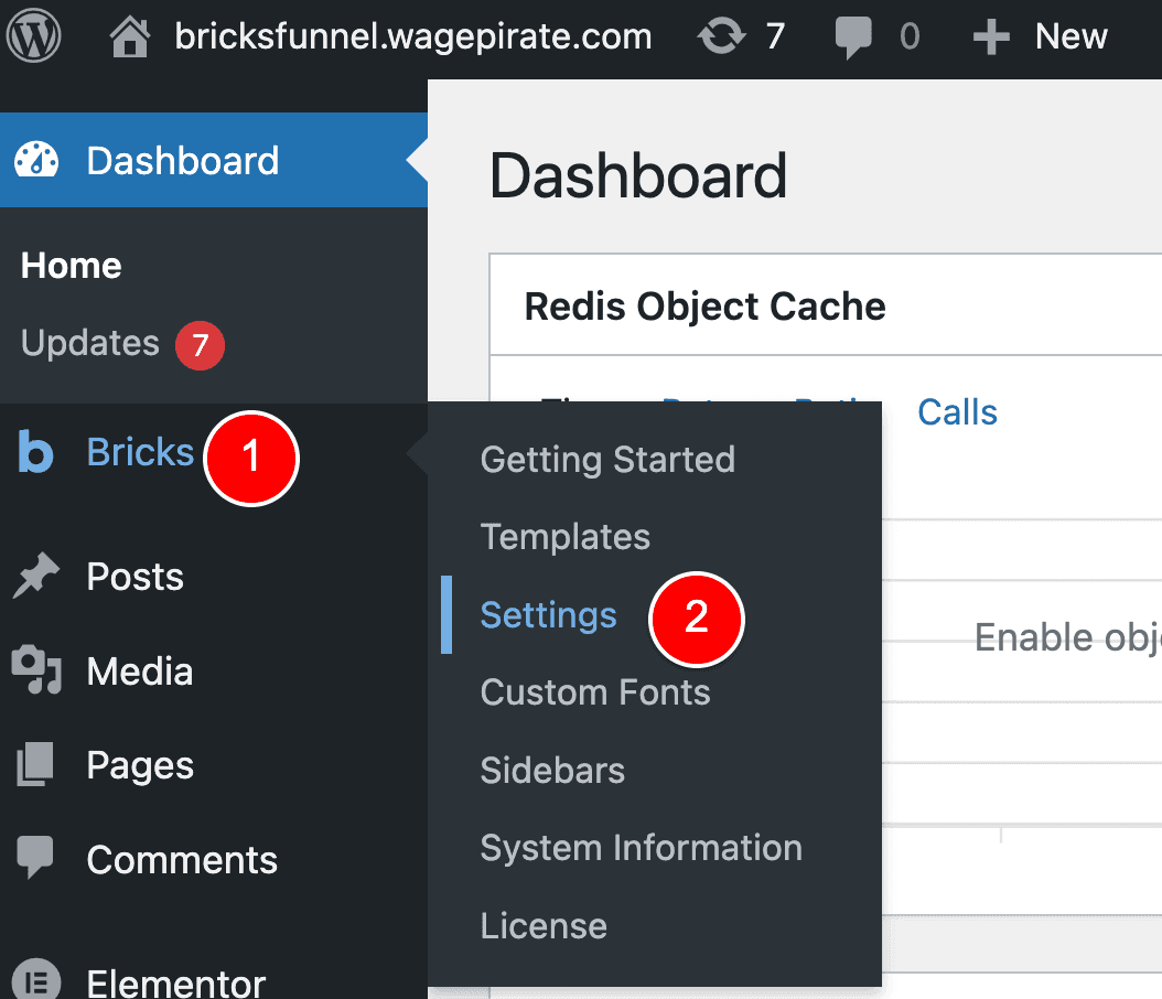
Then click on the Performance tab (1).
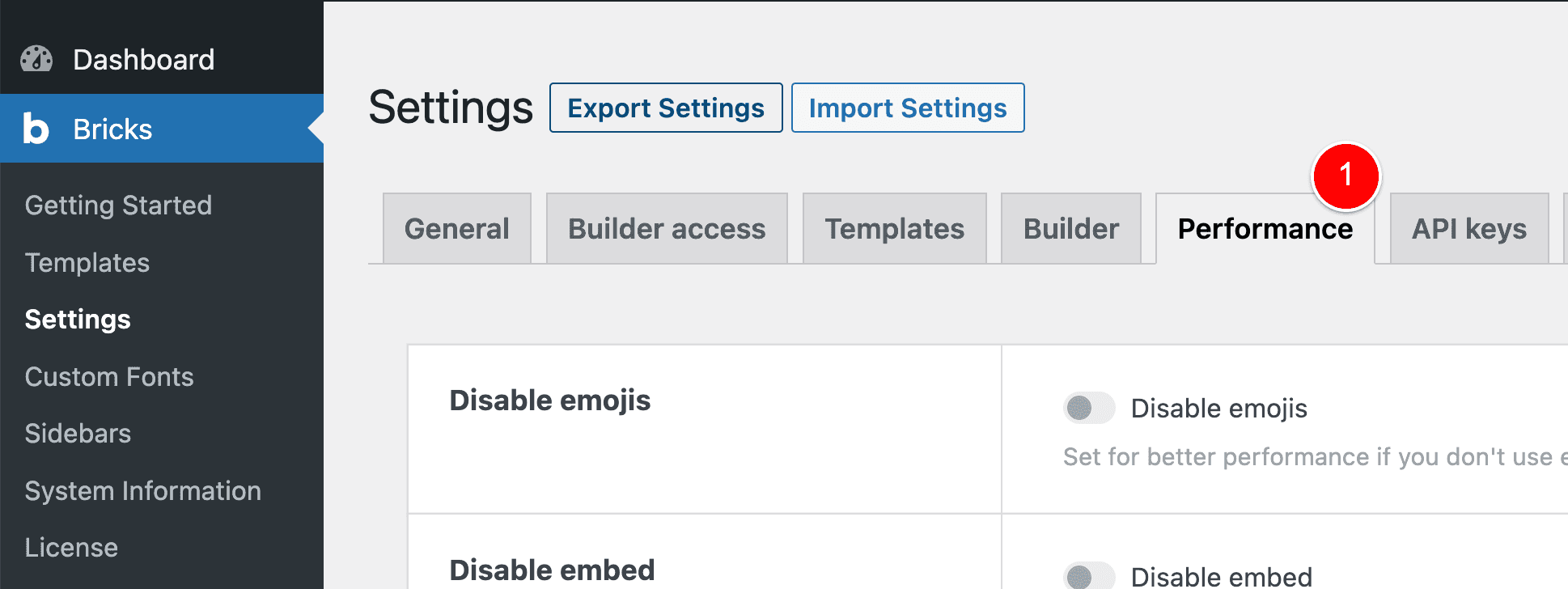
Scroll down and Enable “Disable chaining element & global class” (1) and then click Save Settings (2).
Now, if we visit the front end of our website, reload the page and inspect our code, you will notice the following has occurred:
- Our Block element (1) has the same CSS classes applied as before, except…
- Our .card.brxe-block class has now dropped the brxe-block part and is now only
.card - Because our
.card--darkCSS is applied in the document AFTER the .card class, our .card–dark class now overrides and applies our black background as we want.
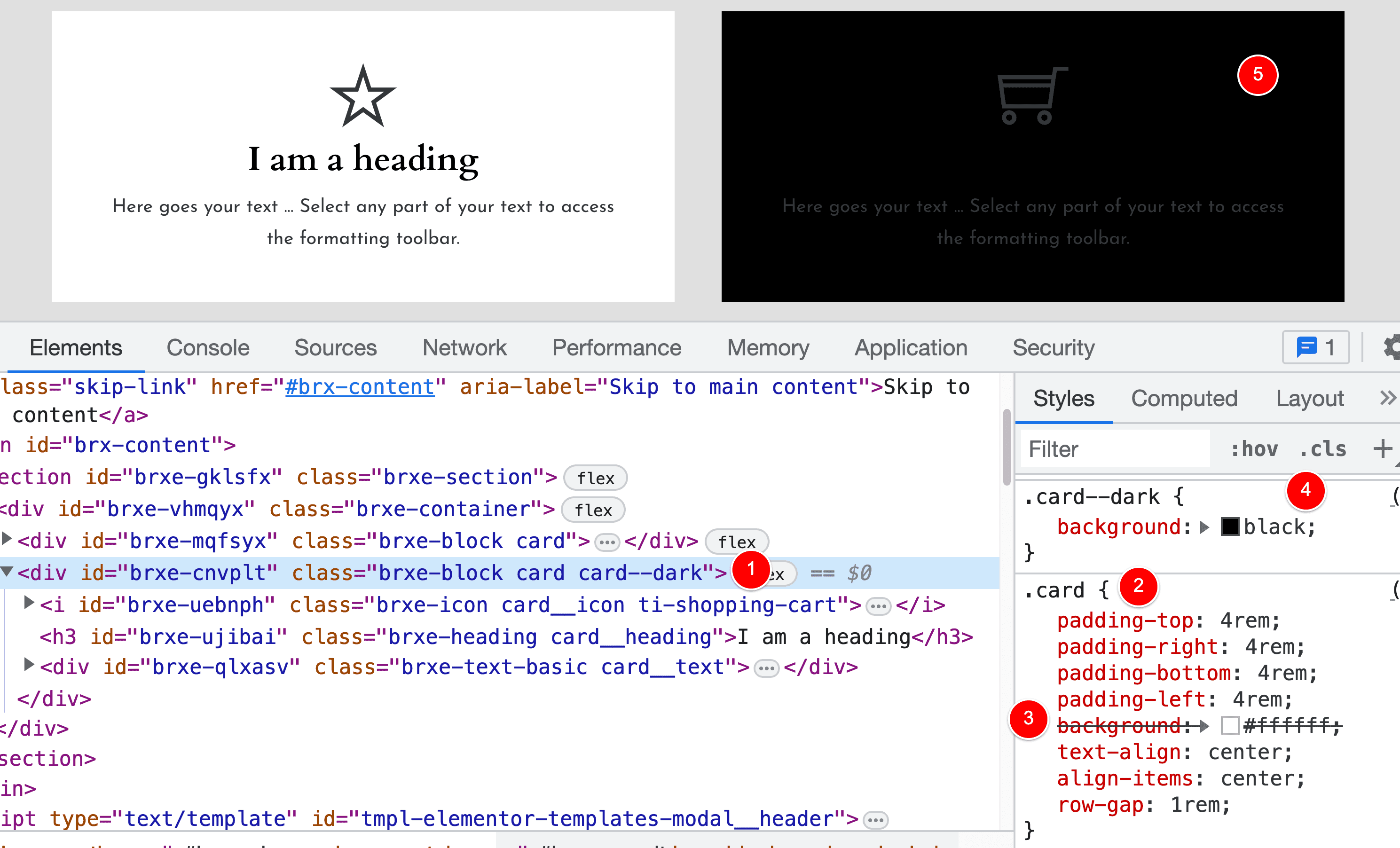
This is why it is very important that you Enable “Disable chaining element & global class” otherwise this will not work for you.
NOTE: Why our .card–dark class is overriding the .card class
Our .card–dark class is overriding our .card class because we created the CSS class AFTER the .card class. It is NOT because of the order that we’ve applied these CSS classes to the Block element in Bricks Builder.
Below shows you what I mean.
See how .card is applied at (1) and then AFTER this, we applied .card--dark?

Then, if we go to the front end and view the code you can see that the order of these classes is “card card–dark” (1) (2), which results in (3) where the black overrides the white background.
But then if we try and swap the order we apply them in and apply .card–dark and THEN .card (1)…
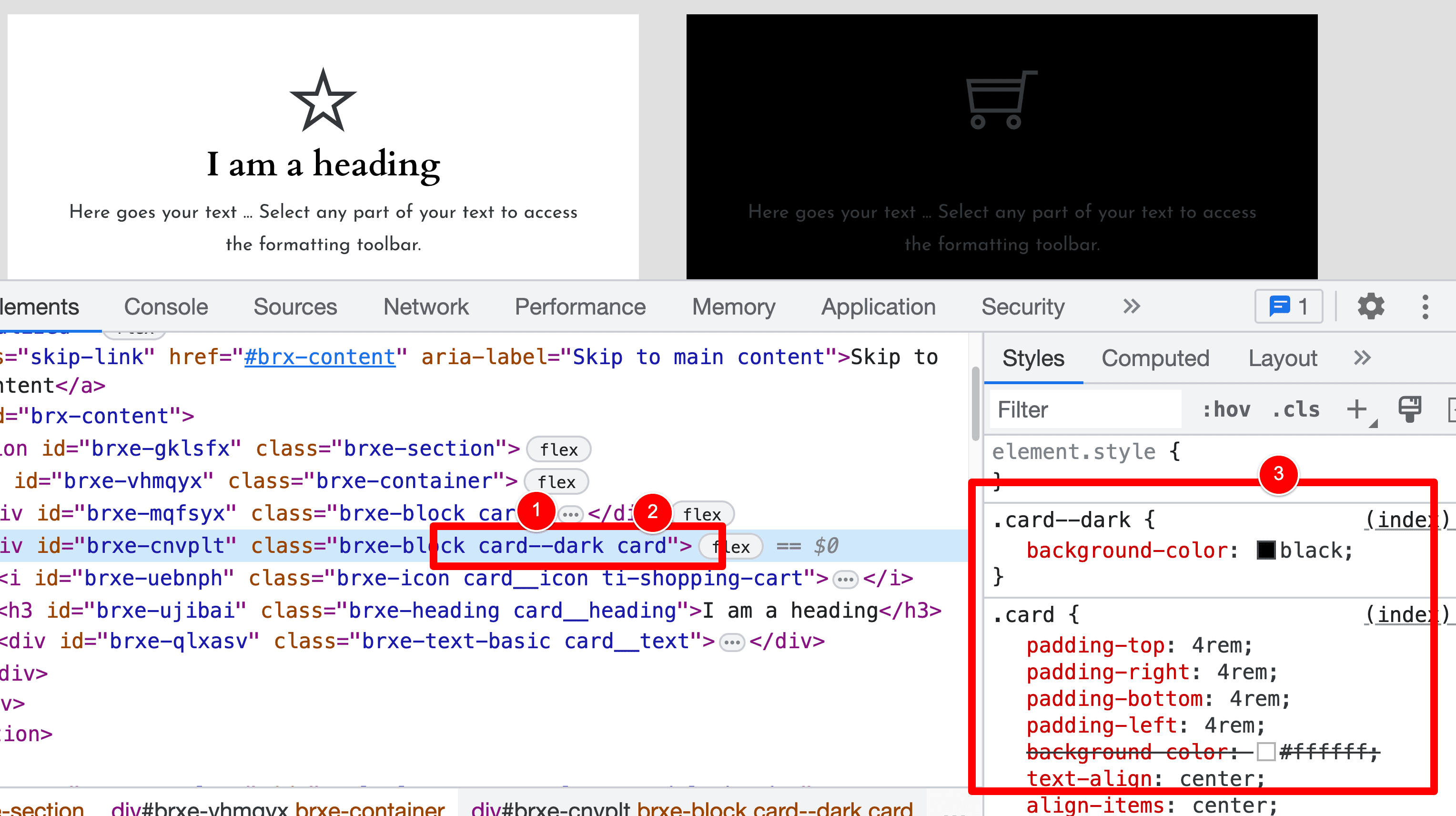
You can see that even if we swap the order of these classes around…
We STILL get the same outcome – the black background from .card–dark overrides the white background of .card.
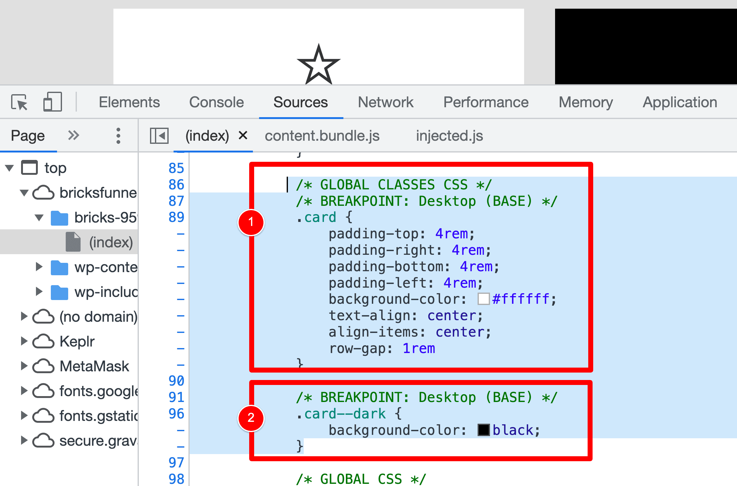
If I view the code to see what’s going on here, I can see the following:
The order in which the CSS classes are output and applied depends on the order in which the classes were created inside Bricks Builder. It does NOT matter what order you apply the CSS class to the actual element.
Step 4: Applying CSS styling to child elements of our .card–dark class
To apply CSS styling to the elements inside our parent .card–dark class, we continue writing CSS inside our Custom CSS box and utilizing the “root” feature.
Below I clicked to continue editing our .card–dark global CSS Class (1) and I have continued to add some CSS (2) to style the following child elements inside of our card Block:
- Icon – make the text white
- Heading – make the text a light grey
- Basic Text – make the text white
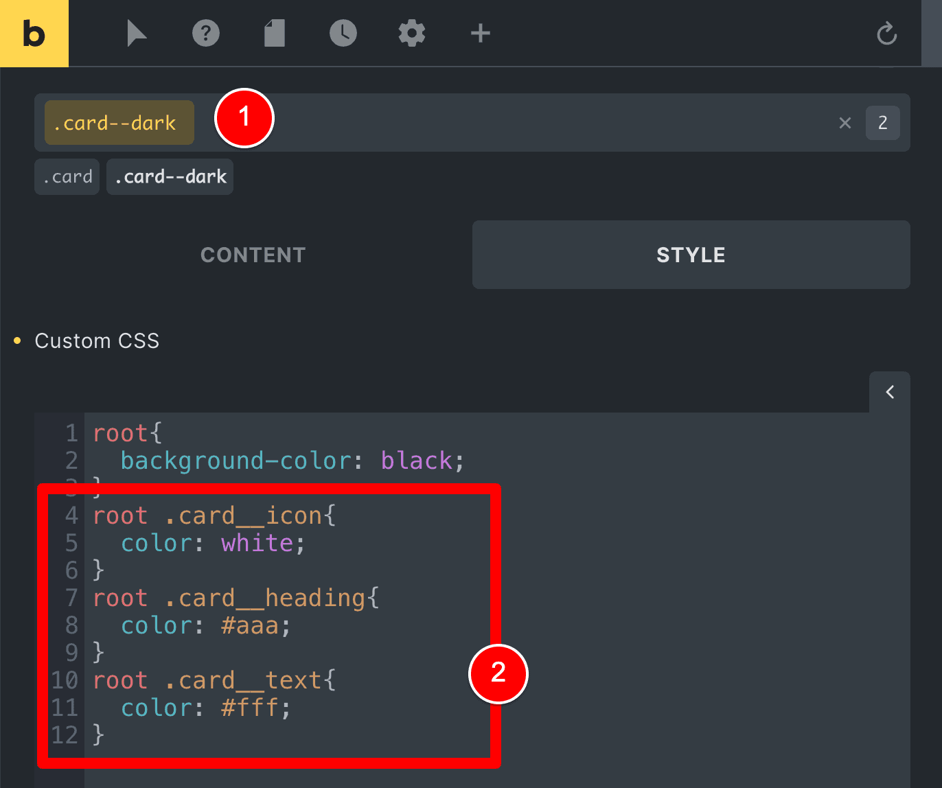
If we save the above and then head over to the front end of our website, we will see the below code output (1) as inline CSS on our page.
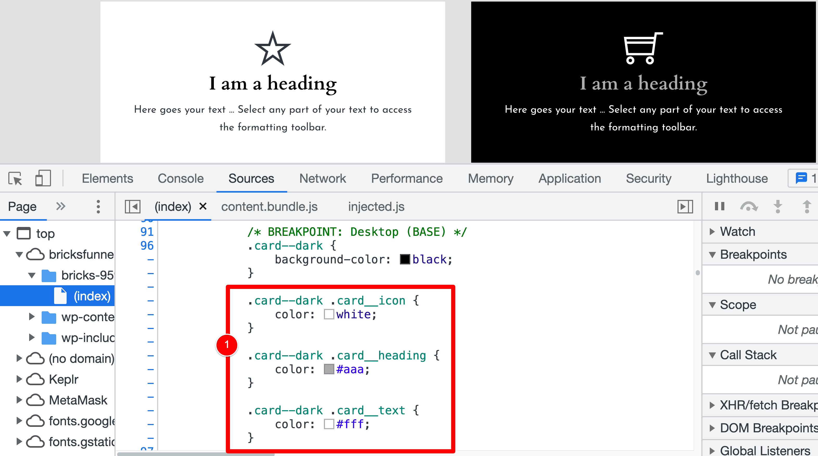
Again, note that wherever we wrote the word “root” has been updated to “card-dark” in our CSS at runtime.
That’s the power of using the “root” feature in Bricks!
Oh, and you might be wondering why we write “root” and don’t just use “card–dark” in our Custom CSS…
It is safer that way and more future-proof.
If we ever want to update the name of this CSS Class, we don’t need to update the class name and then go into this custom CSS and update the CSS here too.
In the future, using “root”, we can just update the class name and our code will automatically output the correct class name in place of “root” at runtime.
SUMMARY: How to add the CSS code when modifying an element using BEM
I recently built wagepirate.com (the website you’re currently on) using BEM and Bricks Builder and the “Disable Class Chaining” feature was one of the most important and liberating features I think Bricks have released for those wanting to use BEM.
As I mentioned previously, this “Disable Class Chaining” feature in Bricks Builder is very new (it’s currently a beta feature at the time of writing this article) but it has unlocked so much potential for users wanting to use BEM in Bricks.
But previously, I was doing most of my class styling in Bricks and then for any modifier classes (like our .card–dark class today) I would head over to WPCodeBox and create a new CSS file there.
And now – with this “Disable Class Chaining” feature, I have been able to write over 90% of all my CSS inside of Bricks Builder.
It not only feels nice and clean but also has the following big benefit…
All my CSS code is in Bricks Builder: If I ever want to edit the CSS styling of a class, I am already in there in the editor and I just need to select the class and make my edits in Bricks using the user interface – I don’t need to go to WPCodeBox and find the correct CSS file and make edits there. This makes managing code easier AND also faster to edit.
Let me know what you think in the comments below.

Leave a Reply