Responsive font sizes in WordPress (and websites in general) have changed a lot over recent years, to the point that I didn’t bother learning what a REM was (lazy of me, I know). If you want to completely understand when to use %, px, em or rem for your font sizes, this article is going to give you everything you need to know (without the technical jargon that is just confusing).
The answer upfront
If you pick a highly-popular WordPress theme like the Astra Theme and set your font sizes in relative units like EM or REM, you’ll be fine and you should focus on writing more content above anything else.
Reputable theme developers have planned out their themes with more time and thought than we could ever hope to dedicate towards this, so feel good knowing that they’ve done all the hard work for you.
Just use relative font sizes and you’ll be fine.
But here is something to consider before you leave this page:
Even though REM is supported by most browsers these days and I just said to use REM where you can…
Why does the Astra Theme for WordPress, which powers over 1 million WordPress websites…

Only give you the option to set your font sizes in PX or EM, but not REM?
I found it very strange too until I dug a bit deeper and took the time to understand how the Astra Theme sets its font sizes and then it all made sense.
In this article, I will go through everything you need to know to understand responsive font sizes by breaking down how the Astra Theme is coded to deal with responsive font sizes, as I think it’s very well thought out.
The core Astra Theme CSS code also defines font sizes set in %, PX, EM and REM, which might sound surprising, right? Why so many different ways to set font sizes?
If you’re wondering why they don’t just use one option and set all their font sizes in that, then you’re going to get a lot of value out of this article.
I learnt a few things while writing this article, too!
Let’s get into it.
The default font size of most browsers
Most browsers will set their default font size at 16px.
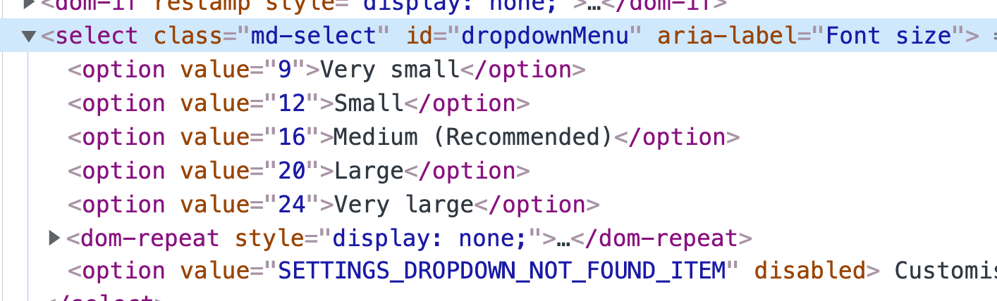
In Google Chrome, if you go to Settings > Appearance, you’ll see this font size option.
By default it recommends you select Medium.
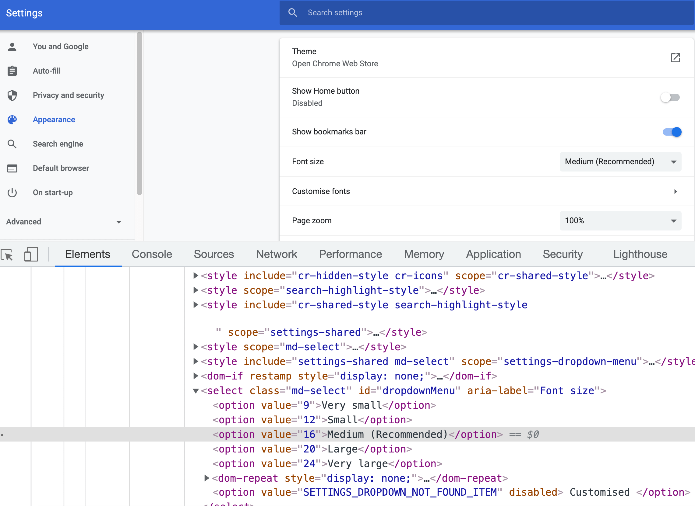
I checked the code here and you can see that Medium in the dropdown sets the font to 16px at the code level (see above image).
Large sets your font size to 20px and so on.
There are two things we can learn from this that will be very relevant to the rest of the article
- Users can set their default font size in PX in their browser.
- The default font size for browsers is usually 16px (as you can see above, that’s the recommended).
Keep that in mind as we continue into the next section.
Give your reader the power to read as they want
Responsive font sizes give your reader the ability to resize the content on your website so that they can read it at the font size that suits them best.
My Dad’s phone is magnified at (I’d estimate) 1.5 x zoom.
Seriously. I look at his phone and it can only fit 5 lines of a message on the screen before he has to scroll.
But that’s him (probably soon to be me haha).
But my Dad needs to scale up the fonts for his eyesight, so he should have the ability to do so.
If my Dad doesn’t have the ability to scale up the fonts on your website so he can read your content, then your website is no good to him.
No matter how good the content is that you’ve written and how much it would help him do the thing he’s searching to do, he can’t read your content – so he will go to the next website.
So now that we understand that this is the most important thing to do – give our reader the option to scale up or down the fonts on our website, the next logical question that you’re probably thinking is:
- How do you allow the user to scale the fonts on your website?
- How do I check if the user can already scale up the fonts on my current website?
And both these questions will be answered in the next section.
Set your body font in %
In a lot of themes (including the Astra theme), you set the body font (i.e. base font of your document) in pixels.
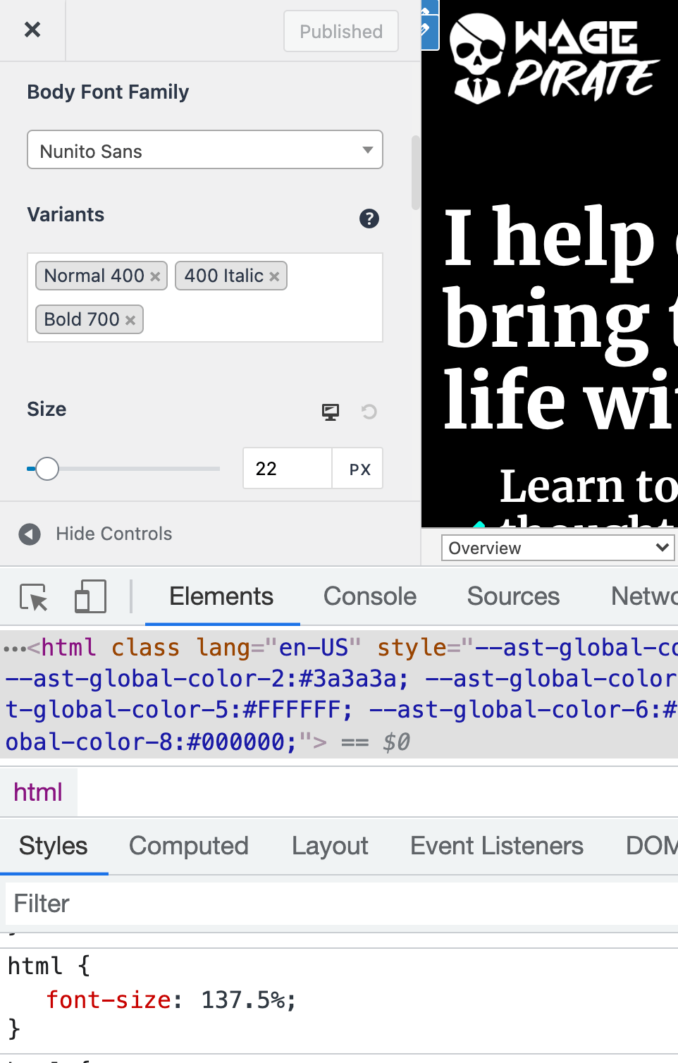
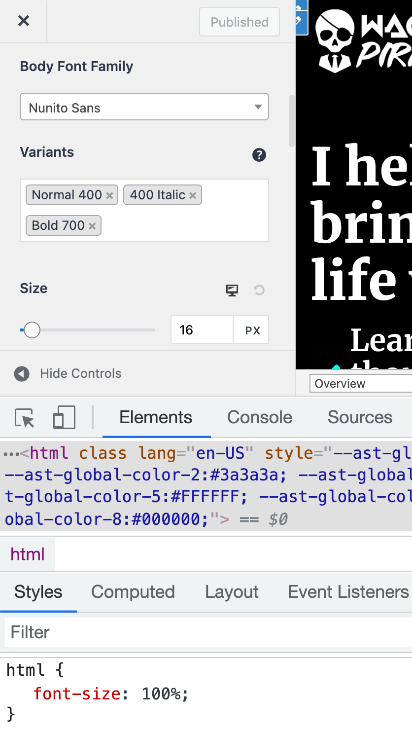
On WagePirate.com, I currently have my body font set to 22px.
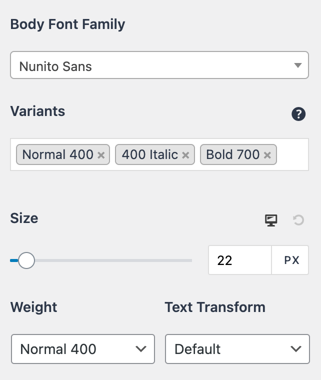
But what is interesting here in the Astra Theme is that, when you set your font size to 22px here, it doesn’t set your <body> element’s font-size to 22px in the code.
When you select 22px here in the settings, it sets your <HTML> element’s font size to 137.5%, as shown below. (remember this 137.5%…)
If I change the font size to be 16px, the font size in the code is set by the Astra Theme to 100%…
So this simple example is a really good way to start looking at our responsive font sizes in WordPress and how they all work.
Because what is happening here, is somewhat quite complex.
Remember that the default browser font size is 16px?
The Astra Theme developers know this, so when you’re in the customizer, if you enter 16px for the font size, they save this as 100%.
If you enter 22px in the customiser like I have currently for WagePirate.com, then 16px x 137.5% = 22px.
Hence, when I select 22px in the theme customizer, the Astra Theme saves this value as 137.5%.
So why does Astra convert our px value for font sizes into %?
Because % values will take into consideration the default font size that the user has set in their browser.
If your User is using Chrome and their eyesight is as bad as my Dad’s, they might set their default font size for Google Chrome to be Large, which sets their default font size to 20px, as shown below.
So by setting the <HTML> element to be 100%, that is saying “Hey, set the font size for this page to be 100% the size of the user’s default font size they’ve set in their browser”.
So by using % on the <HTML> element here, the user is given the ability to set the default font size (using their browser default).
Now, if using % on the <HTML> element sets the font size to be 100% the size of the user’s default font size setting in the browser, what is the alternative?
How would you set a font size in your website that ignores your users’ default font size setting they’ve set in their browser? (i.e. not good?)…
You would use pixels! (px)…
If we set our <html> element to be 16px and hard-coded that 16px into the <HTML> element, then the website would use 16px as the base font size and my dad’s setting of Large (20px) in his browser would be ignored.
Again, this is what you don’t want to do.
The golden rule is to allow your readers to consume your content in the font size they choose.
So % gives more power to the user, whereas if we define the font size in px for the user, we take that power away from them.
An interesting thought about using % for your body copy
The more I dove into this topic to update this article, the more I started to rethink the way I have set up font sizes on my website.
Here’s why….
Let’s say that the entire web defined their <HTML> element to be font size 100%.
My Dad would go into his Google Chrome settings and then choose “Large” as his default font size, which would be 20px (as we learnt above).
Based on him selecting this, we can assume that my Dad likes to read content at 20px.
On WagePirate.com, I like my font a bit larger myself for the content on my website (for reasons we’ll cover a bit later on when we look at the ideal character count per line), so I have set my font size for the body copy in the Astra Theme to be 22px, which we know from above is saved at 137.5% by the Astra Theme.
Now, let’s say my Dad visits my website with his default Chrome Font size set at Large (20px), which is the font size he likes to read content at.
20px x 137.5% = 27.5px for the body font on my website, which is quite large (but not too large, as I’ll cover later in this article).
Based on this, my Dad may need to zoom out when he reads the content on my website because it would be larger than what he was expecting to read my content at.
If you consider that, it would make the most sense if all websites set their <HTML> font size to be 100% all the time and then any changes to this would be based on the user’s default browser font size.
So, if my dad has Large (20px) set as his default browser font size and visits my website, he will see my content at the expected 20px font size.
Based on that, it had me rethinking my choice to set WagePirate.com body copy to be 22px (i.e. 137.5% in Astra).
But there are also some other things to consider, which we will get into now.
Because I actually decided to leave my font size as 22px in Astra and thus have my <HTML> element at 137.5%.
And it is because of this…
The number of characters per line affects how easy your content is to read
Another factor to consider, other than the size of your font, is how many characters or words there are per line on your website.
There is no 100% clear “this is the best” number of characters to have per line, but there are guidelines we can work between.
It seems to be commonly accepted that having 50-60 characters per line (including spaces) is ideal and up to 70 characters are acceptable.
Here are the reasons to worry about the number of characters per line in your content:
- Too many characters in a line of content make it hard for our eyes to keep track of what line we’re on as we read. I’ve experienced this myself and I’m sure you have too. You read a line of text that is very long and as you go to move to the next line, your eyes get confused as to what the next line is. This is what long lines of text with many words and characters do to our brain.
- Too few characters per line of content will make your reader’s eyes constantly go back and forth as they read, which will distract them, break their rhythm and, ultimately, make it harder for them to understand what you’ve written.
This is why I set my body font size for WagePirate.com to be 22px (i.e. 137.5% of 16px).
Below, I took a random line of text from a WagePirate.com article and put it into a character counter online.
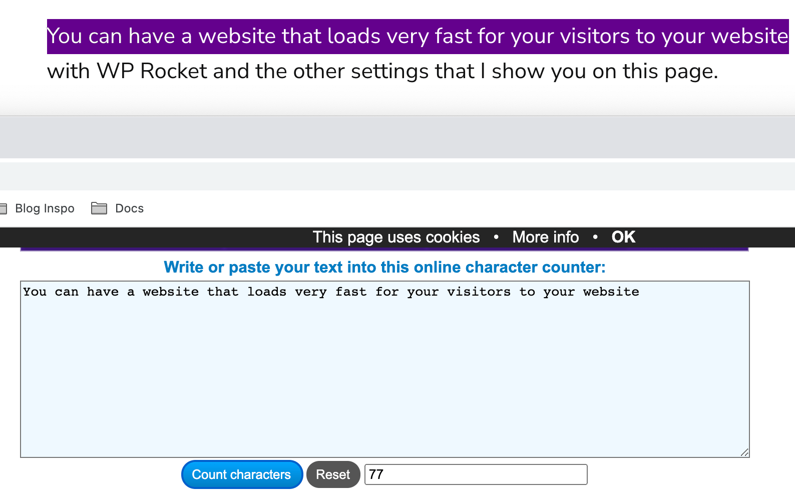
It says 77 characters are on this line and, after doing it for many different lines of text, I found I averaged anywhere from 68-80 words per line on my website.
If I change the font size on my website to 16px in Astra, which we know sets it in the code as 100%, that character count changes to over 100 characters per line!
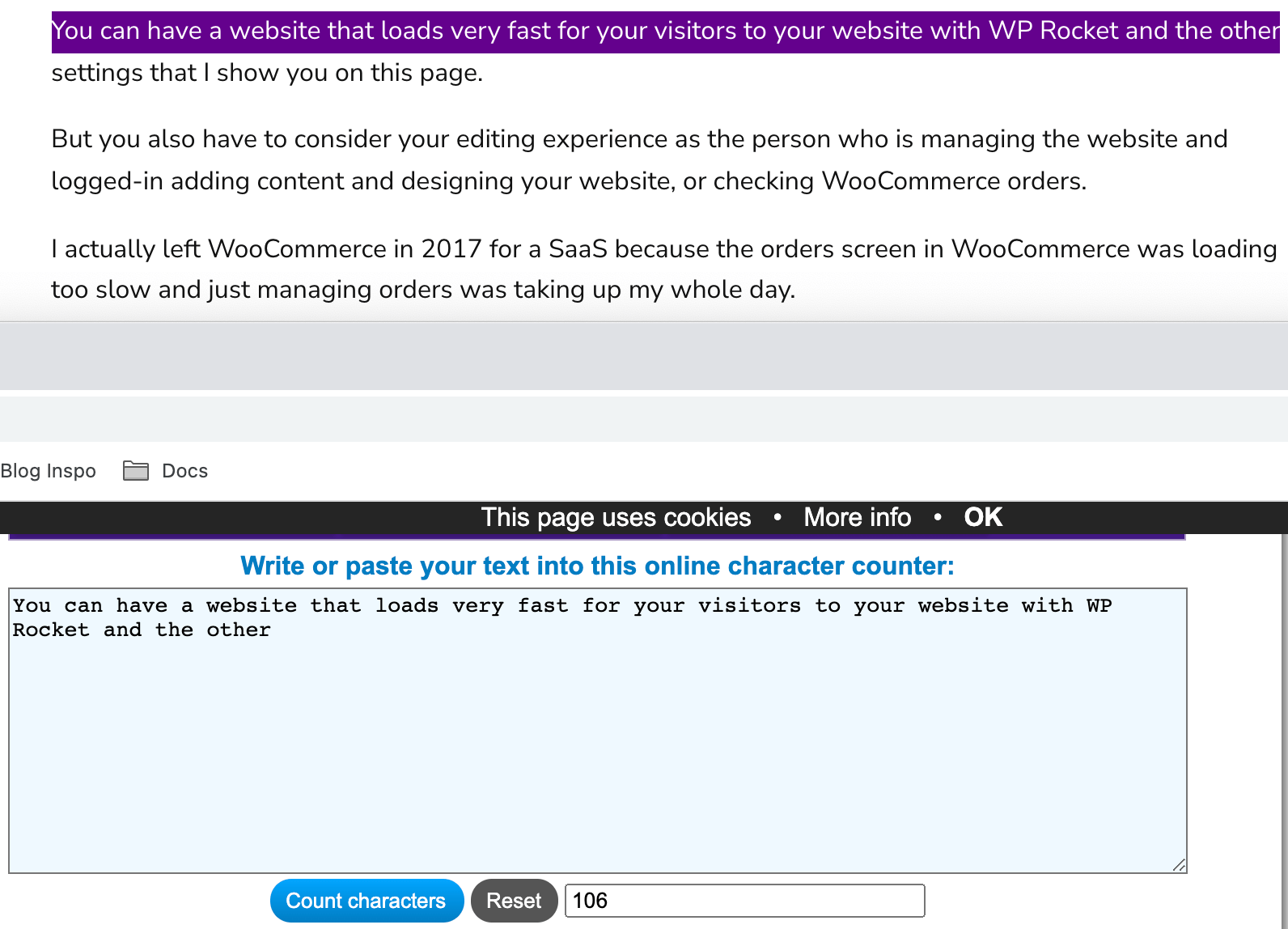
If I try to read this at 106 characters per line, it is very difficult for me to focus on what I’ve written in my content.
The number of characters you use per line DOES make a massive difference to how easy your content is to pay attention to while reading.
Sorry – I feel like so far this article is giving you no hope or clarity on what you should be using, but I’ll try to get more black and white towards the end.
This stuff is just all-important to consider and I find it very interesting.
How to control the number of characters per line in your content
The obvious way to control the number of characters per line in our text is to increase/decrease our font size.
The second option we have is to make our content area narrower or wider.
After setting my font size to 16px in Astra’s settings (i.e. 100% in the code), I just feel the character could is just way too long to be readable.
So I would have to make my content area narrower.
Even to get around 83 characters per line, at a font size of 100% (16px) I would need to set my content area to be 960px.
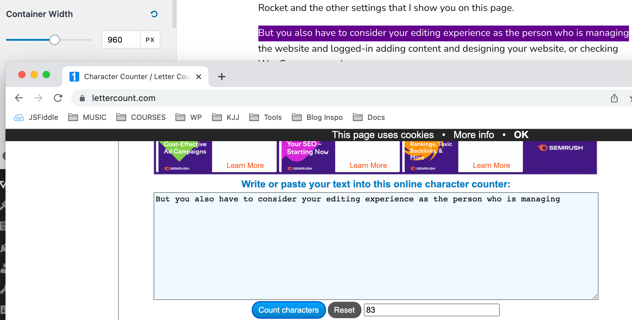
With monitors being so large these days and things like ultra-wide monitors being quite normal, this just seems way too narrow.
Currently, WagePirate.com has a content area width of 1200px – so it’s a big jump down.
My final decision on how to set my Body Copy font size
All things considered, I have decided to keep my font size for my <HTML> element as 22px in Astra’s settings, which saves it in the code as 137.5%. Here’s why…
It came down to the fact that setting my font size at 16px in Astra, which saves in the code as 100%, just caused my website to have way too many characters per line. I hated reading my content at this font size and I don’t want other’s to feel that way, either.
So setting my font size at 22px (saved at 137.5%) makes my content a lot easier to read with the ideal 70-80 characters per line.
The next thing I had to consider is how many people are changing their default font size in their browser?
It would only be a very small % of users, and at 137.5% font size, my font is going to be “too large” rather than too small for most users who change their default font size, which I think is not so bad.
If a user has their Google Chrome default font setting set to Large (20px), it would mean that my content renders for them with a font size of 27.5px, which is large but still readable.
We can’t completely ignore the fact that users can zoom
While I have solely focused on the default font size that can be set in browsers, we also need to consider the fact that users can zoom in and out of their browsers.
And I do this.
I zoom in and out all the time. COMMAND and + or – on my mac does this.
Page Zooming in your browser zooms everything in and out, which I like a lot.
It doesn’t just scale up the fonts, so when people zoom in and out of my website, the number of characters per line stays the same (as long as their device is wide enough, of course).
In this day and age, I think a lot of people are used to zooming in and out VS setting a default font size in their browser.
My Dad zooms, so he is one example.
In summary, by choosing 22px as my default font size in Astra, which saves it as 137.5% in the code, I:
- Have a large font size that is easy to read
- The number of characters per line makes my content ideal for reading
- Due to the Astra theme saving the font size in a % under the surface, a user can have their default font size they’ve set in their browser affect the font size on my website (this is good).
- People who have a large default font size set in their browser will just see my content is a larger font size than expected (which I don’t think is all that bad considering that people who will experience this have already had to set their font size large, so they need large fonts).
A bit more complex than you maybe thought, right?
And that’s just our body font size.
Now let’s look at our other elements like our Headings and the different ways we can set their font sizes using relative measurements REM and EM.
What are REM and EM for font sizes?
REM and EM are known as relative measurements for font sizes and I use them for all the elements on my page except the body copy (HTML) that we have just previously looked at.
For REM and EM to be relative, you need to give them something absolute to be relative too.
For example, say you set your Body Font size to be 22px in Astra like I have, which we know saves in the code as 137.5%, and the user has not changed their default font size in chrome.
So 137.5% is rendered as 22px.
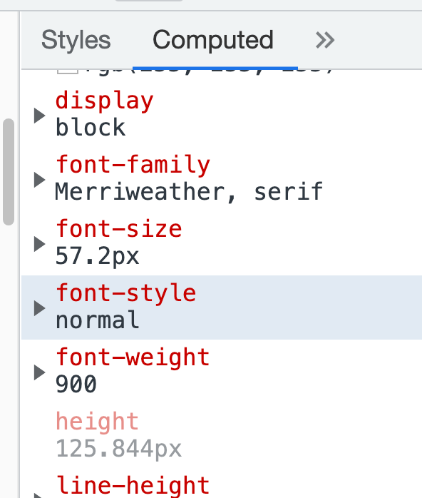
Now, let’s say we set our <h1> tags to be 2.6em.
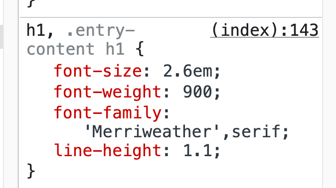
What that means is that our <H1> tags will be rendered at 2.6 x 22px = 57.2px.
Here, I can confirm that the 2.6em <h1> tag is indeed rendered at the expected 57.2px font size, as shown below.
Why you should use relative font sizes
The good thing about relative font sizes being relative to the size of the body copy font size is the fact that if the user increases the body copy font size, your headings and other elements set in em or rem scale up proportionately, too (as their size is relative to the size of the body copy font).
You want your headings to stand out, so you might like your <H1> to be double the size of your body copy.
So you want to maintain that proportion if the user changes the size of their default font – and that’s exactly what em and rem allow you to do!
The difference between REM and EM
REM is relative to the root element in your document, whereas EM is relative to the parent element.
It’s very important to note this difference.
If I have the following:
<meta charset="utf-8"><HTML><BODY><DIV><P>Code language: HTML, XML (xml)and we assume the user has not changed their default font size in chrome…
If we set the following font sizes…
<HTML 137.5%><BODY><DIV><P 1em>Code language: HTML, XML (xml)We would get the following result.
<HTML 22px ><BODY><DIV><P 22px>Code language: HTML, XML (xml)Now, let’s set the following, where we set the font size of the <DIV> to be 1.5em:
<HTML 137.5%><BODY><DIV 1.5em><P 1.1em>Code language: HTML, XML (xml)This would render the following font sizes:
<HTML 22px><BODY><DIV 33px><P 36.3px>Code language: HTML, XML (xml)This is our first takeaway: EM is relative to the parent font size.
Initially, the <P> tag didn’t have any parent elements that have font sizes specified, so it was relative to the size of the <HTML> element.
But when we set the <DIV> to have a font size of 1.5em, the <P> tag now had a parent with a font size declared, so the <P> font size was now relative to the <DIV> and not the <HTML> element.
This is how EM font sizes work – they are relative to their parent element’s font size. If no parent element has a font size set, then em is relative to the font size of the root document font size (the HTML element).
REM, on the other hand, IGNORES parent element font sizes and ALWAYS sets the font size based on the root <HTML> element.
So this below:
<HTML 137.5%><BODY><DIV 1.5rem><P 1.1rem>Code language: HTML, XML (xml)Would render the following font sizes:
<HTML 22px><BODY><DIV 33px><P 24.2px>Code language: HTML, XML (xml)So that’s the difference between EM and REM.
EM considers the font size of parent elements, where as REM goes only off the font size of the root <HTML> element.
BUT…both of these fonts are RELATIVE i.e. they are relative to the size of other font sizes.
Should you use REM or EM for font sizes
For responsive font sizes in WordPress, I would recommend using REM as it seems much easier to manage than EM.
With EM, sometimes you don’t get the result you expect because you forgot that a parent element has a font size set.
At least with REM, none of that matters – if you know your body font size is 100% i.e. 16px, and you want a font size of 32px, you can write 2rem and be sure you’ll get that font size rendered at 32px.
There’s no chance of a parent element randomly being in there and affecting its size, as could happen if you set 2em instead.
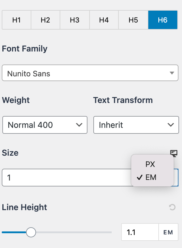
Why the Astra WordPress theme does not give you the option to set REM
After considering everything about fonts, I found it weird that one of the most popular WordPress themes does not allow you to set font sizes in REM.
You can only set font sizes in px or em, as shown below.
What I found is that the Astra theme is very conscious about where it sets font sizes on parent elements and that it rarely does set them.
So nearly every font size you set in em is acting as if it is set in rem because there are no parent elements set with font sizes in between.
And that brings us to the end of the article, where I’ll leave you with the following:
If you choose a theme that is quite popular like the Astra WordPress theme, you can assume they’ve done all this complex thinking for you.
I really wouldn’t stress about it all that much. They’ve done all the hard work.
As long as you do NOT use px for your font sizes and choose to you EM or REM (if your theme supports it), you should be fine and you really should be focusing on other things like increasing sales and writing more content.
Leave a Reply